

The #NCGreatPerformances project—the Newberry Consort’s pandemic-inspired YouTube series—works like this: David and Ellen select a concert to highlight, choose the pieces to include, and create an audio master of the excerpts; David sends me the audio; I’m off to the races.
For some of these programs, I created a slideshow for the original concert. At first I expected a one-to-one relationship for videos drawn from those programs: basically just export the PowerPoint slides as images and sync to the audio track. Turns out that that’s not a great solution.
Why? Motion. PowerPoint can do amazing things, but it doesn’t do video effects well. Want to slowly zoom in on a detail while cycling through a number of supertitles? Not gonna happen in PowerPoint. Much of what I’ve developed in terms of style is a constellation of workarounds to approximate that kind of motion. The kind of motion that is colloquially named for the filmmaker I unwittingly learned it from: the Ken Burns effect. I’ve long since gotten over those limitations and embraced them. If nothing else, it’s a great reminder that the projections are merely a supplement to the live performance.
Turning to video meant, among other things, stepping back from a style built on workarounds built for a particular set of limitations. Suddenly I can Ken Burns the heck out of the materials. At the same time, static imagery that would be undistracting in live performance is, for a “concert video,” just boring. There’s a conversation to be had about whether “visually boring” is bad thing. But I find myself on a particular curatorial path. Without distracting from or debasing the aural experience, I want to pair it with complementary imagery and guide the viewer/listener through that imagery to to create a sort of composite storytelling.
Pasticcio madness and method
The recent Pomo d’oro video (posted March 5th) is an interesting study in balancing media, venues, and artwork.
The work, of course, was an imperial spectacle. Burnacini’s set designs are the obvious go-to source for imagery. Easy. It would be a very simple matter to pan-and-zoom through a few of them for fifteen minutes, even given a few constraints. (There are only so many of them and not all of them are available online, in a high-res form, and without rights limitations.)
For the live concert there was another consideration, this time theatrical. Il pomo d’oro is a mythological tale crammed with characters, situations, themes, and in-jokes that would have been instantly recognizable to an early modern audience. Just as projected supertitle translations remove a barrier for modern attendees, projected imagery has the potential to tacitly explain certain turns of phrase that might otherwise seem arcane if not totally random.
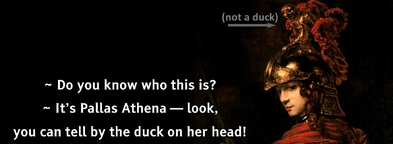
Ellen suggested a visual solution to one such in-joke. At one point in the story, the character Momo identifies Athena by “the duck on her head.” You’ll recall that Athena is associated with the owl (of wisdom); she’s often portrayed with an owl nearby… sometimes as a crest on her helmet. Momo’s quip is pretty funny, but only if you’ve been saturated in Athena-with-owls imagery. (A screencap of the slideshow is the featured image on this post; I’ll say more about this and the show’s other joke in another post.)
Within my own set of constraints (mainly money and access), I found precisely one usable depiction of Athena with an owl-crowned helmet: a moody, dark painting attributed to Rembrandt. It’s beautiful and simple.

Because of the owl, I had to make this painting work. That meant accommodating both the simplicity and the dimensions (taller than it is wide makes it tricky).
What’s more, this painting moves the center of visual gravity. Here’s where visual consonance comes into play. There are three goddess scenes: Juno, Athena, and Venus. With Athena’s image set, the other two should be similar—or at least in the ballpark. Colorful, slightly swishy and imprecise, brooding if possible, and/or appealing to the text (or subtext) being sung.
Taking it a step further, how do these three colorful images jibe with the Burnacini engravings? Do they? Can they? In cases like this I usually try to create some sort of visual form. If the music is in ABA form, then the imagery can follow suit: engraving, lavish painting, engraving, for instance. Consonance needn’t mean complete uniformity.
To be honest, if I’m remembering correctly, I gave up on the higher order “formal” ideas in creating the slideshow. The die was cast: the goddesses get lavish colorful paintings, end of story. Mixing in other imagery felt disruptive rather than helpful. And…it was fine.
Turning all of that into a video was another matter. To avoid lengthy static frames, I used motion and incorporated a number of additional images, primarily Burnacini’s set designs. Even in this incarnation, though, there’s less formal coherence than I would’ve liked. Call it a fantasia. Call it a pasticcio. It seems to have worked.